yOU KNOW WHAT THAT IS? Growth
In 2019, the Electronic Library for Minnesota rebranded itself as eLibrary Minnesota, a website where all Minnesotans have access to scholarly journals, local and national newspapers, encyclopedia articles, and so much more. The team behind the website, which was affectionately referred to as ELM, wanted to steer clear of any imagery related to the elm tree—but I was optimistic I could change their minds.


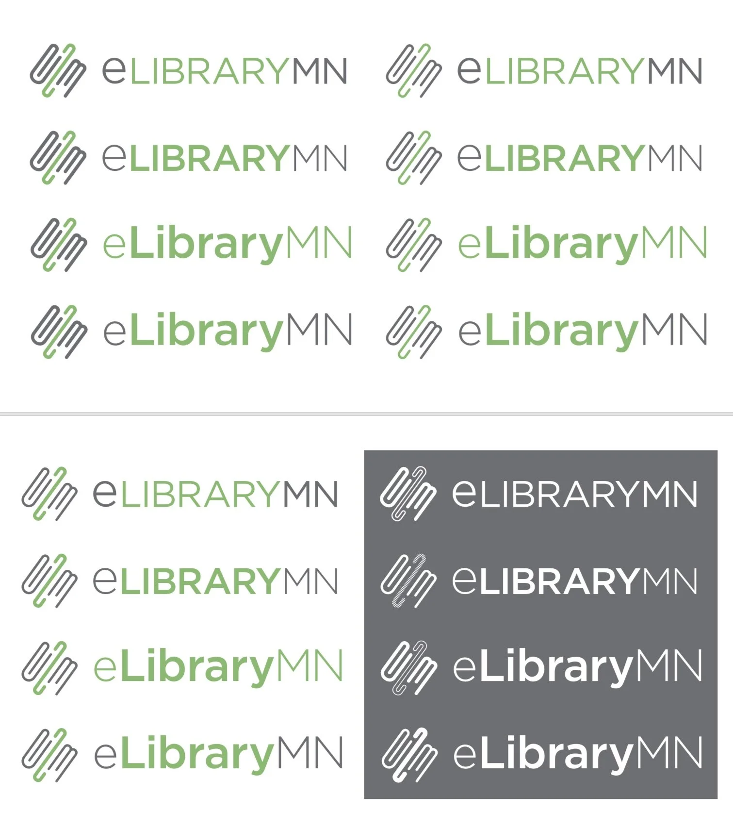
I started with iconography based on localization and access, with shapes that were easily recognizable to the K-12 students who make up a majority of the ELM audience. We universally agreed that while there were some elements here that we liked, the youthful designs and colors could be alienating for the adults in our target demographic.


I decided to swing the pendulum fully in the other direction and went with more muted colors and higher-concept text and image treatments in the next iteration of designs. The ELM team loved the color palette, but something still felt missing.
When the team changed their mind and asked to see a tree-related logo concept, I knew just what to do. Elongating the L and adding its now signature leaves were just the touches the logo needed to feel elevated and scholastic, and this led to some fun variations on a theme for the secondary sizes, as well.


